
Planned Parenthood
Rebranding Project
BY ANGELA PU
|
Planned Parenthood is one of the most controversial medical institutions in modern memory. The company in recent years has been synonymous with the abortion debate and has been villainized by many people and news outlets. When doing my preliminary research, I realized that Planned Parenthood is much more than the debate on abortion. They have a large range of services both onsite as well as online. This is why I decided to rebrand them for my class project and focus on the messaging behind everything to emphasize the breadth of services Planned Parenthood offers.
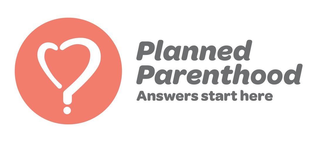
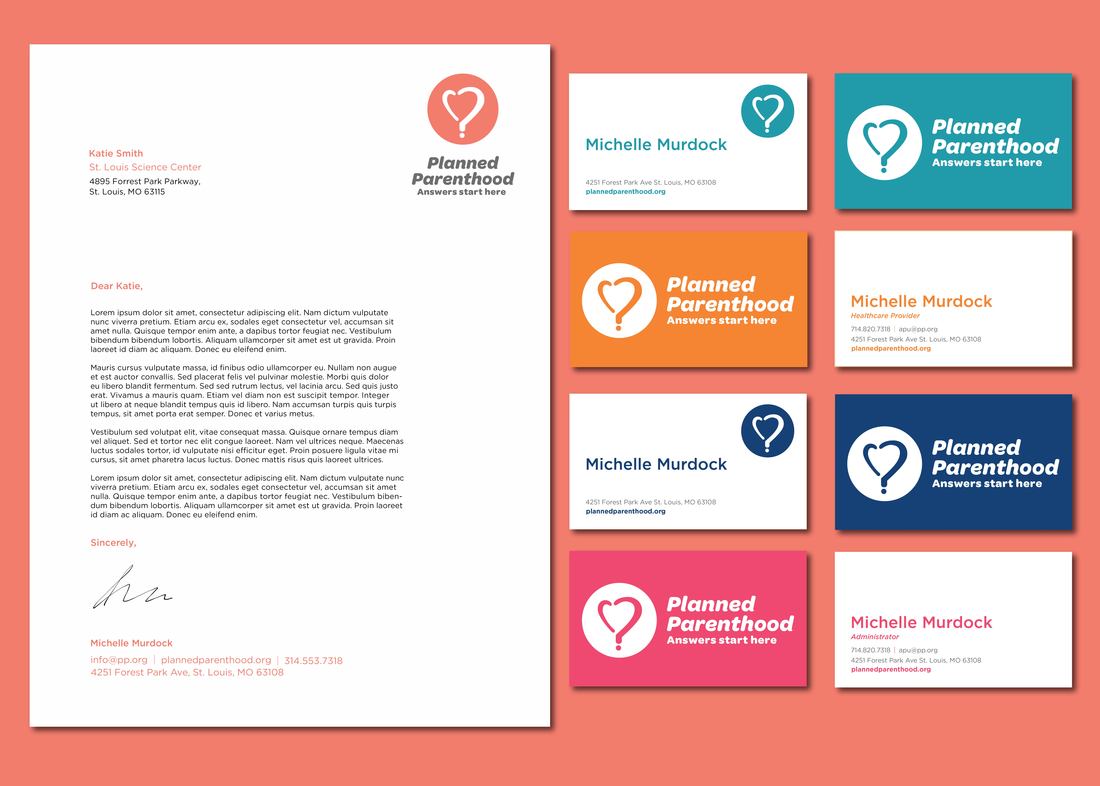
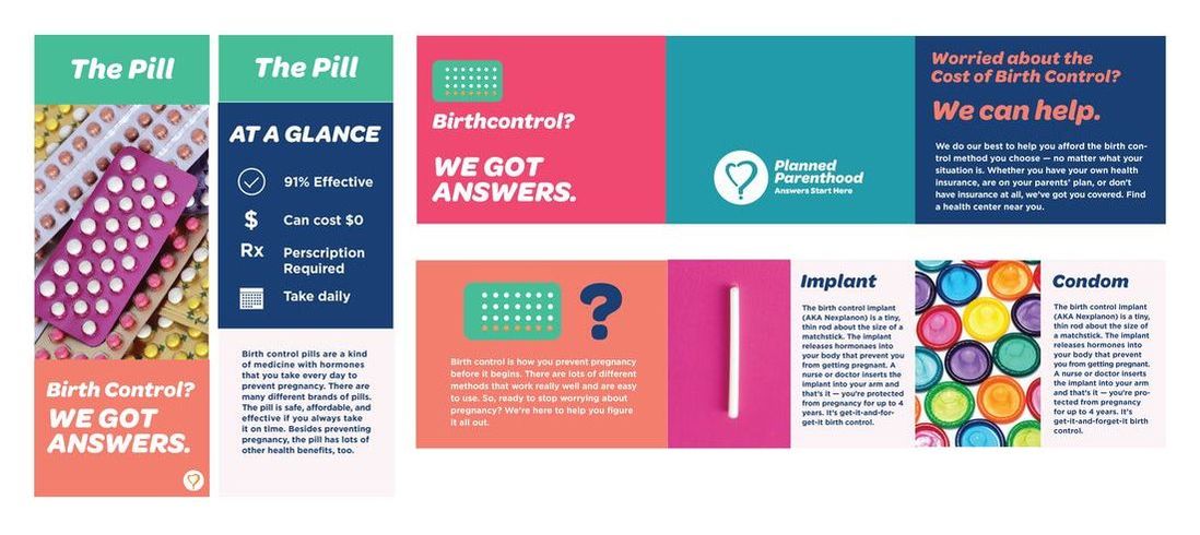
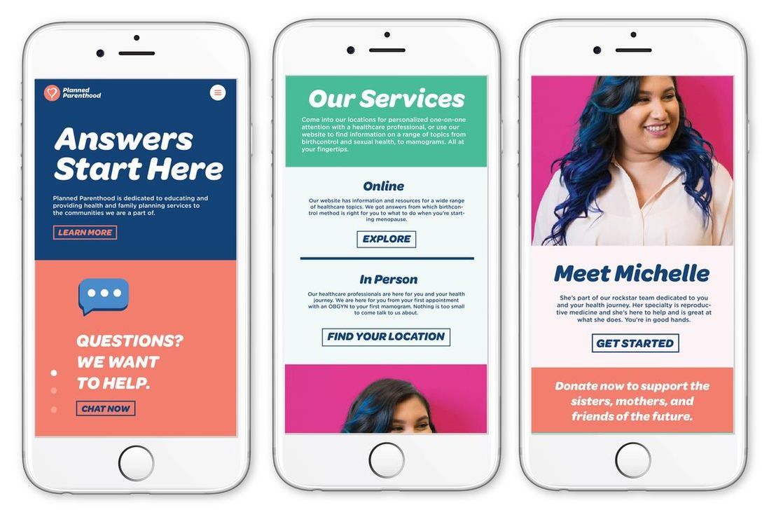
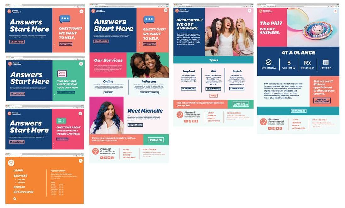
I began with the tagline to help influence the logo development. Through some research on other healthcare institutions in the area, I concluded that healthcare is confusing; surprisingly, something so basic as your health and wellness is extremely hard to navigate. With this in mind, I wanted to highlight the breadth of services that Planned Parenthood offers as well as the ease of access to information. This is how I came to the tagline "Answers Start Here" to connote the idea of a journey and emphasize the question and answer format of a lot of the deliverables. My deliverables have a multi-pronged approach. Planned Parenthood has a very prevalent web presence that is used to disseminate information as well as help encourage people to go into the physical locations, which is why I built out the homepage as well as a more information heavy page as well as the mobile version. The print deliverables are separated into corporate, outreach, and on-site messaging. The corporate messaging is more conservative because it needs to be flexible and be adapted to different people and applications. The outreach consists of a pull-up banner and quarter letter sized leaflets that would be given out to help drive people to the website to learn more. The in-store print deliverables focus on bringing a bit of cohesion to the individual locations as well as teach customers about specific issues. |
|
